Designers Criticize Tate McRae’s New Single Cover for Lacking Artistic Appeal
Tate McRae, the rising pop sensation, has unveiled a teaser for her latest single titled “Housewife.” The promotional material showcases a moody, luxurious superyacht backdrop, igniting speculation among fans regarding the themes and influences behind her new music. However, the spotlight has shifted to an unexpected aspect of her branding—its font choice.
The single’s design prominently features an ultra-light Helvetica typeface, recognized as one of the most iconic fonts in graphic design history. This decision has elicited mixed reactions within creative circles, with designers and fans divided in their assessments. While some consider the choice a bold return to a classic aesthetic reminiscent of the early 2000s, others view it as an uninspired misstep that fails to innovate.
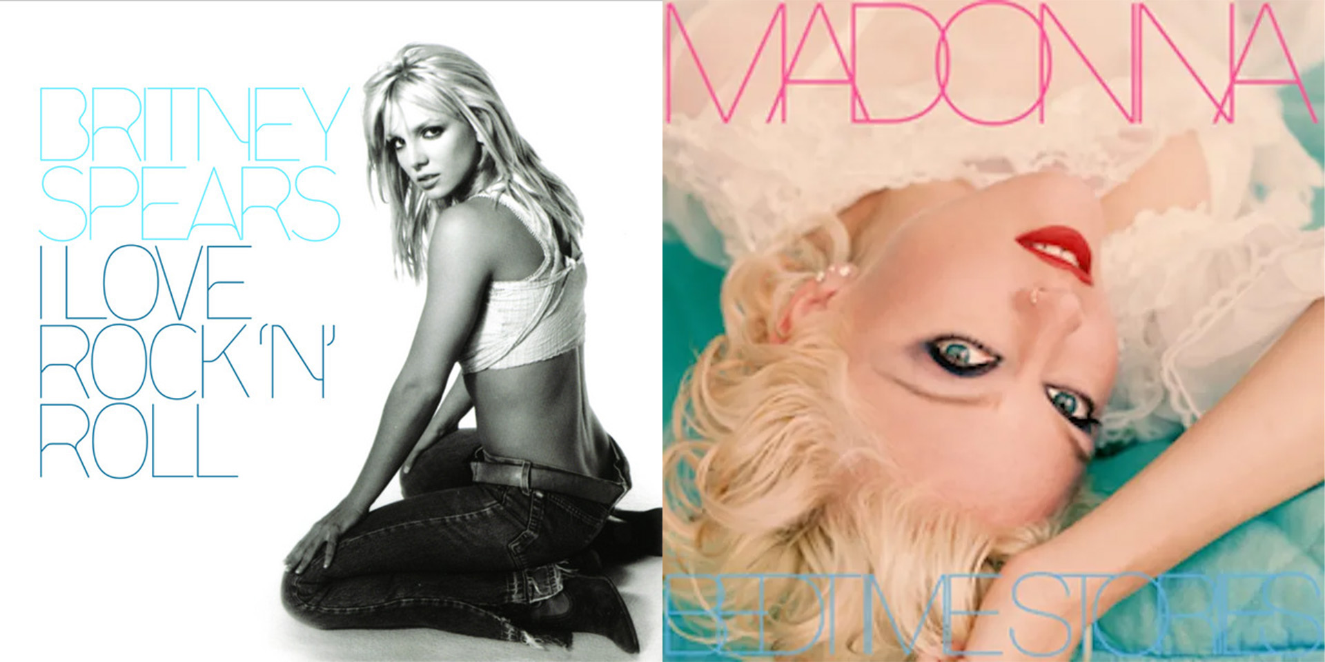
Critics have expressed their disdain on social media platforms, voicing their concerns about the font’s appropriateness for contemporary music branding. Commentators have referred to the choice as an “error” in the realm of design, drawing comparisons to notable album covers from the past, including Britney Spears’ “I Love Rock ‘N’ Roll” and Madonna’s “Bedtime Stories.” These comparisons serve to highlight the struggles that certain design elements face in remaining relevant in an evolving industry.
The ultra-light Helvetica font, in particular, has been both praised for its clean lines and derided for its perceived lack of personality. Critiques range from playful jabs to more pointed comments, suggesting that McRae’s design choice could alienate segments of her fan base who prefer more daring typography. This backlash underscores the significant role that visual identity plays in the music industry, where branding can impact listener engagement and market performance.
As McRae navigates the challenges of establishing her artistic identity, the conversation sparked by her single and its associated branding serves as a reminder of the intricate relationship between music, design, and audience perception. The anticipation surrounding “Housewife” continues to build, leaving many to wonder how these creative decisions will resonate with listeners once the single is officially released.
#entertainment #technology